Colour and fonts create the mood of a design in an instant. A few simple rules prevent most beginner mistakes.
Colour combinations that work
The colour wheel shows how colours relate to each other. Three reliable ways to choose colours:
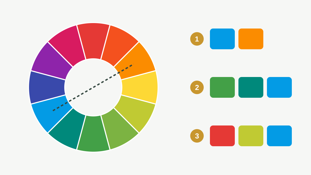
Practical rules:
- Use one main colour, one or two supporting colours, and neutrals (white, grey, near-black).
- A useful balance is roughly 60% main or neutral colour, 30% supporting, 10% accent.
- Use the accent for the one thing people must act on: the button, the price, the phone number.
- Follow the client's brand colours exactly. In Canva, type the colour's hex code (for example
#0F6E56) instead of guessing.
Contrast: can people read it?
Text must stand out clearly from its background, on a small phone screen and in bright sunlight.
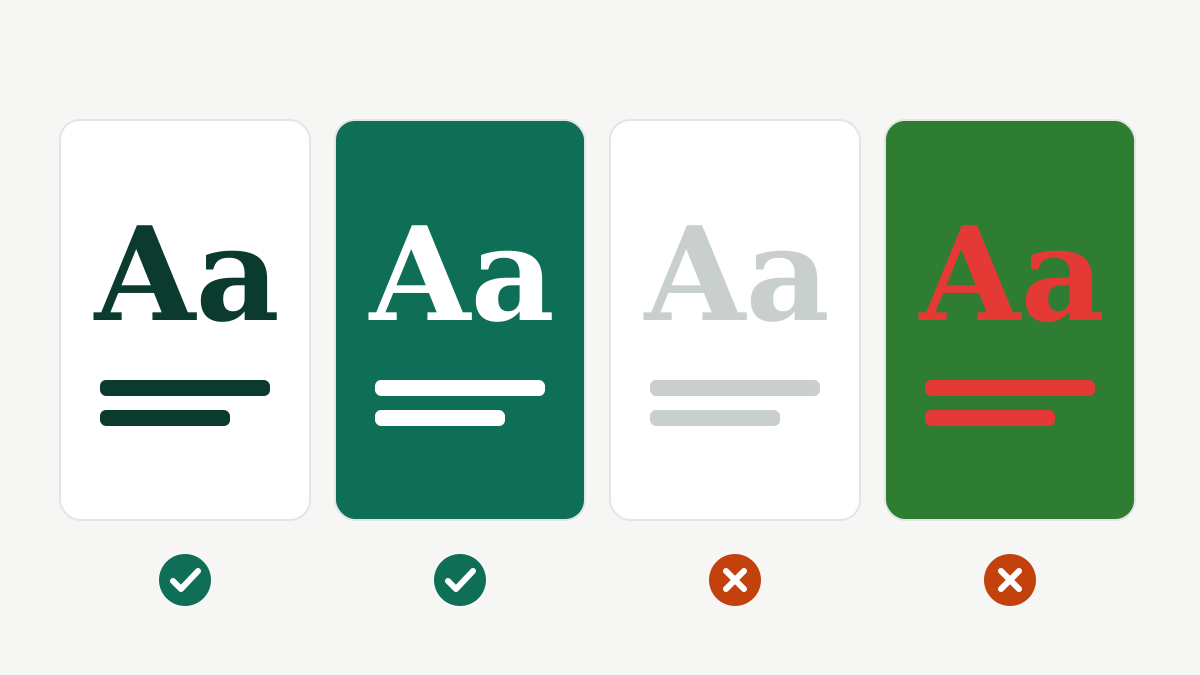
- Dark text on a light background, or light text on a dark background.
- Avoid placing text directly on a busy photo. Add a solid shape or a dark overlay behind it.
- Do not rely on red versus green alone to show a difference.
Typography: choosing fonts
Typography is how text looks: the font, size, spacing and line length.
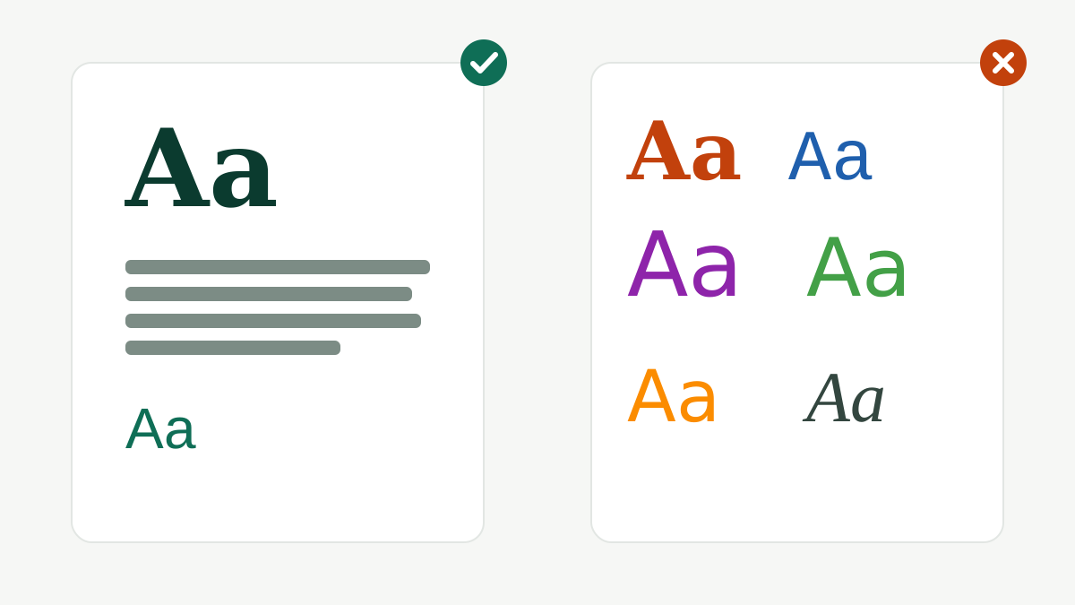
- Use two fonts at most: one for headings, one for body text. Pairing a bold display font with a simple sans-serif is a safe choice.
- Keep body text simple and readable; decorative script fonts are only for a word or two.
- Leave enough line spacing, especially in Urdu Nastaliq, which needs extra room.
- For Urdu and Arabic, use fonts made for those scripts (Canva lists them when you type in that language). Check that letters join correctly before downloading.
- Never stretch or squash text to fit; change the size or the words instead.
Mood
- Dark green and gold: trust, finance, premium.
- Bright colours and rounded fonts: children, food, fun.
- Black, white and thin fonts: fashion, luxury, minimal.
These are tendencies, not laws. Always design for the client's audience, not for your own taste.
Practice task (20 min)
- Choose a fictional business (for example a café) and pick a palette: one main colour, one supporting colour, one accent and neutrals. Write the hex codes.
- Choose one heading font and one body font.
- Design one post using only these colours and fonts, and check the text contrast on your phone.
Sign in or create a free account to save your progress and take the tests. Sign in